my new wordpress blog
ok i had finally decided on a theme for my new wordpress (WP) blog. there are so many choices that i just don’t know which to choose. all of them are good. i spent hours each day choosing. i picked one, and later changed my mind again when i browse the theme. ya i know i’m so fickle minded. 🙂
as i said originally i wanted 3 columns theme, as this present blog of mine has 3 columns too, but i decided to try for 2 columns instead. at first i wanted blue colour theme but i was thinking maybe time for another colour – and i choose green – another nature colour.
there are a number of nice 2 columns themes… but they have empty spaces on the right and left. i don’t like this kind of design. why leave empty spaces – wasted. one example of this is jeff ooi’s new blog design. you will notice right and left empty space. take a look at suanie’s blog… same thing. i prefer designs like yvy’s, where there are not empty spaces on right and left. of course i know one can always teak the template of the theme to adjust the size, thus making no spaces, but no. 1, i am talking about original and no. 2, i might not know how to tweak it.
i had finally narrow down on 7 choices. at first i thought of this design known as ‘lime green’:
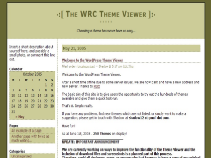
this design also comes in blue colour… if i decided to go back to blue:
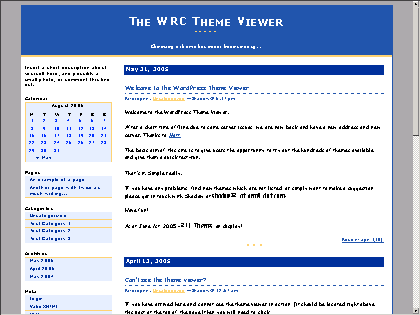
it is quite nice, but i don’t kind of like the green colour, and i don’t fancy a calendar in my blog, right on top (ok ok i know i can edit the theme but as i said i’m talking original ok).
this theme is quite ok too, nice green colour:
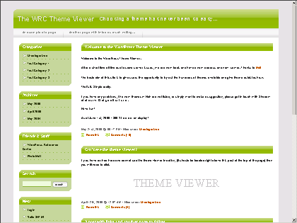
but i don’t quite like the left column with seperate boxes for each section… because they kind of stand out.
then i suddenly came across this design (slashdot) which i like very much!
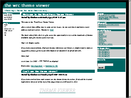
it is back to 3 columns for this one… but the nice thing about it is that the left column has only 2 sections, so the theme won’t kind of look congested (like my present 3 columns blog!).
i had wanted to use this theme for my WP blog… but then i suddenly saw this one (with the funny name ‘aaglatt’):
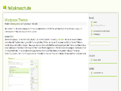
ahh! this looks nice and neat. nice LIGHT green colour, and i like the blockquote that it uses. so finally i decided to go for this one.
you will notice all the themes i choose have white background. there was one with dark blue background that i kind of like:
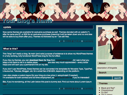
but i’m not used to having my own blog with coloured background yet.
i also like this one (travelogue)especially the date design: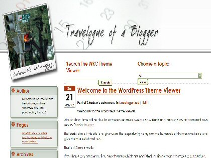
and was on the verge of picking it to be used but then i realise though i like the date which stand out, as the name of the blog suggest (travelogue), this theme is more suitable for a travel blog. it is with travel blog, that one need the dates to stand out, and since my blog is a regular blog, doesn’t need the dates to stand out.
now that i have chosen the theme, it’s time for me to fiddle with the blog, to test how to post and all that e.g. to put up links and photos and so on. i will reveal my new blog only after i am satisfied with my twiddling (eh? no such word?) here and there.
note: a big thank you to booringest, my web host for helping me to set up the blog. hey, i still have lots of Qs to ask you, you know! i’m very new to WP and there’s so much to learn. if you see my new blog very ‘bare’ please bear with me as i’m still learning… learning how to use WP, how/where/what to put links or use whatever features WP has. whatever… those are secondary… now as long as the content (blog post) and comments part are ok, that’s good enough.
i will reveal my new blog later in another post. watch out!





Leave a Reply
You must be logged in to post a comment.